(Using Google Maps to visualize opportunities and success)
Dan Lucarelli is the Director – Marketing and Education for Pennsylvania 811
As a small business, do you know where your prospects or customers are? As a nonprofit, can you show your Board of Directors your success in outreach efforts? In today’s business climate, data visualization is an increasingly important marketing tool to make decisions, solicit support for your cause or show success in meaningful and easy to understand ways. Fortunately, powerful geographic visualization tools exist. This article describes how to build a simple geographic data visualization using Google Maps.
First, please take a moment to review two examples: https://goo.gl/hgu5d1 and https://goo.gl/FEGjCL.
The first example is a map of public libraries in Pennsylvania. You could be a small business with a product or service for libraries, and want to know where your prospects are to help sales efforts. The second example is a report to a nonprofit Board of Directors, showing the impact of an outreach effort from a stakeholder group. Note that both maps are interactive; that is, the recipient can pan, zoom and click on the map icons for more information. If the addresses are detailed, and the map is zoomed in close, the user can even drag the street view map icon (the man in the lower right corner of the browser window) on the map to view the address. This interactive visualization is much more meaningful and impactful than traditional list- or table-based reporting, especially if the report has geographic data such as addresses.
In order to build these types of data visualizations for your organization, you need two things: An account with Google, and a spreadsheet (either a Google Sheets or Excel workbook) with a list of addresses you want to show on the map.
Spreadsheet of Addresses. The first step to creating a data visualization is to have some data to visualize. Do you have:
- A list of customers?
- A list of competitor locations?
- A list of stakeholder interactions?
- A list of attendees to an event?
- A Christmas card list of your friends and family?
Data visualization does not work if there is no data to visualize. The spreadsheet should look like a table, with one row per address, and named columns of the following format:
- This is the full, qualified address, and should include as much information as you have. For example, the first address in the Public Libraries table is for the Abington Township Public Library in York PA. The address column contains “1030 Old York Rd, Abington, PA 19001” in the spreadsheet cell.
- Other columns you would like the user to view. For example, the Libraries map also includes columns for the community name, the library name, and the telephone number for the library.
- An optional “Pin” column. This column can be used to change the map icon on a row-by-row basis – for example, customers are shown with a green map icon and prospects with a red map icon.
It is good practice to place the address in the first column in the spreadsheet. This will facilitate automatic address recognition when the data is imported.
Your data can be an Excel spreadsheet, a Google Sheet spreadsheet, or a CSV (Comma delimited) file. This is what the first few rows of the Libraries spreadsheet looks like:
Once you have a spreadsheet, you can build a visualization.
Google Account. The next step is to log in to Google at https://accounts.google.com. Use your Gmail account and password. If you do not yet have a Google account, you can create one under the <More Options> link. After you are logged in, navigate to the <Google Drive> app at (https://drive.google.com)
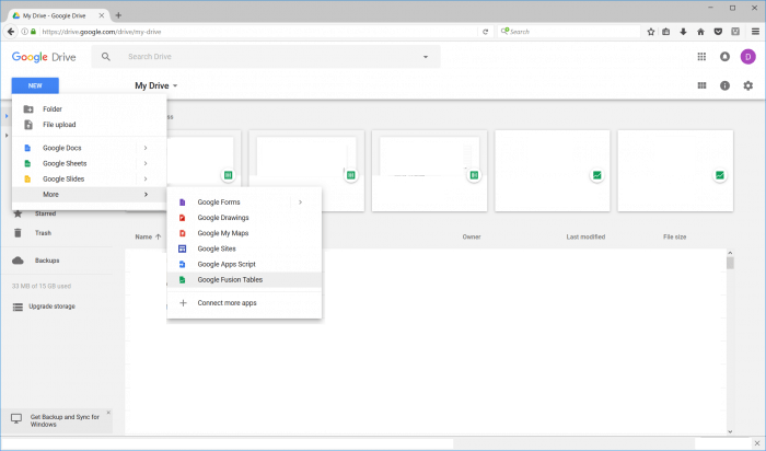
Choose <New> <More> <Google Fusion Tables>.
Fusion Tables is the mechanism that translates a table with addresses into an interactive map. It uses Google’s mapping engine, APIs, and geocoding engine to build interactive maps that can be zoomed, panned, and shared. Best of all, the app is no cost and can be used to construct sophisticated data visualizations with almost no computer programming or HTML knowledge.
When you choose the Google Fusion Tables app, you are presented with a screen to import your spreadsheet. <Browse> to the Excel spreadsheet on your computer or pick from the list of Google Sheets. When you have selected the file, click <Next>. Google will import the table and show a preview. Click <Next> again to import the spreadsheet. Google will present a screen that shows table attribute information. Review or change, then click <Finish>. Google will import the spreadsheet into a Fusion table.
By default, Fusion Tables created three views of the imported data: “Rows”, “Cards”, and “Map”. The Rows view is structured like a spreadsheet and is the default view. Clicking on the Cards tab presents the data as a series of index cards. When you click on the Map view…
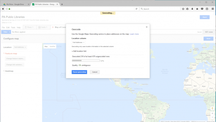
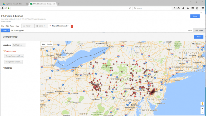
Google will begin geocoding the table, one row at a time. When geocoding is complete, Google presents the map:
Congratulations! You have just created a map from data in a spreadsheet. It is now time to test pan, zoom, street view, and clicking on a map icon to see the underlying data from the columns in the spreadsheet. Changes to the look and feel of the map are accomplished with the <Change features styles…>” button. Changes to the window when the user clicks on the map icon are located behind the “<Change info window…>” button.
If the map needs to be viewed by others, the blue <Share> button in the upper right corner of the browser window controls access by others. The default map security is private to you, and can be set to public, only those that know the link, or only specific named users. By default, Google saves the Fusion table in your Google Drive folder with the same name as the imported spreadsheet.
When publishing Fusion Tables, you will also want to consider:
- The URL in the browser window can be shared with others, as long as the access is set to “Those with the link” or “Public”. When you share this URL, users will see the browser window as presented above, including the ability to view the Rows and Cards view, and use the data filtering options.
- To only share the map, without the ability to change views or filter, choose <Tools> <Publish>. This will present a URL that displays the map only full screen in a browser window. This is the most secure method to share a map with others.
With a spreadsheet, you probably already have and a Google account, you can create powerful geographic visualizations to help make better decisions, spot trends, or enhance your advocacy story in meaningful and impactful ways.
Dan Lucarelli is the Director – Marketing and Education for Pennsylvania 811 (www.paonecall.org), a not for profit trade association in Pennsylvania (USA) whose purpose is to prevent damage to underground utilities. Mr. Lucarelli earned a Bachelor of Science degree from Slippery Rock University and an MBA from the University of Pittsburgh. He is a member of the American Marketing Association (www.ama.org), the Common Ground Alliance (www.commongroundalliance.com) and the Pittsburgh Technology Council (www.pghtech.org). Mr. Lucarelli can be reached at dan@dlucarelli.com. http://www.dlucarelli.com.


