Tangible Revelations
By Mac Love
Manager of Business Development, Sterling Brands
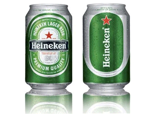
I have a crush on the new Heineken can.
Until recently, Heineken’s iconic green cans and bottles had 15 different designs in 170 different markets worldwide. When the Dutch brewer chose to address their inconsistencies, narrowing the range of design offerings down to 5, they also applied valuable consumer and equity learnings to capture the innovative spirit and dynamic aura of the brand.
While other brands bragged about their centrifugal bottle necks and temperature sensitive ink, Heineken successfully differentiated themselves with a unique look and feel that evolved their brand heritage with sophistication for contemporary drinkers. Using a first-to-market raised ink printing technique, the new Heineken can has a substantial tactile sensation that is easy to grip and pleasant to the touch.
Heineken is the #1 selling European Lager in the United States and has positioned itself strongly for the future. The brand’s new packaging has “a unique texture that is immediately noticeable and creates a more enjoyable drinking experience for our consumers,” says Filip Wouters, VP of Marketing for Heineken. “As the market leader we pride ourselves on being progressive in design as well as taste,” adds Mark van Iterson, Global Manager of Heineken Design and Concept.
The combination of tactile distinction with classically sophisticated graphics ups the ante for Heineken and its competitors. In an ever increasing virtual world, richer sensory stimulation could prove to be a big opportunity for brand differentiation and lasting engagement.
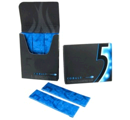
Five Gum’s “Stimulate Your Senses” marketing campaign from 2007 stands as an interesting recent precursor for the unique opportunity brands have today to differentiate with multiple-sensory communications in packaging.
From 2003 to 2006 the core young demographic of gum purchasers had lost interest in the brands they had to choose from, reflected by a steady decline in sales. In research teens referred to the leading brands as “generic” and wrote them off as “breath-fresheners” or “long lasting flavor”. Only Orbit had an identity the younger demographic could recognize and appreciate. Orbit’s unique style, quirky humor and creative packaging engaged young consumers in a way that the established brands were not. Wrigley saw this opportunity and found another niche to mine: self expression.
 Five Gum launched quietly, building a powerful core group of primary explorers who could testify to the brand’s innovative, modern and mysterious presence. This was a brand that could exist alongside iPods, cell phones, the Wii, shoes, sunglasses and the other trending accessories in young consumer’s lives. How did Five Gum do it? How did it make young consumers feel understood and comfortable with this new brand?
Wrigley’s learned that in the young consumer’s quest for autonomy and independence, they submit themselves to “self-challenges” in an effort to overcome the obstacles they identify between themselves and their aspirations for adult-level confidence. This demographic was hungry for the unknown and driven to go beyond those who came before. In short, they were “experience junkies”. Five Gum was designed to have “experience” as its lead gene.
The next time you see Five Gum at your store, take note of its subtle details. The nutritional facts are printed on the outer wrapper, creating a wholly sensory packaging experience once the plastic is removed. Every element of the packaging is designed to reinforce the Five Gum difference, from the 3 rows of 5 sticks of gum inside to the glossy foil around each stick with 5 Five Gum logos on each.
My favorite detail of Five Gum is the textured pleats on the opening tab of the pack. In light or dark, the pack is easy to navigate, access and reseal. These textured pleats are there for your thumb the way your home button is positioned on your latest cellphone or tech device. This is smart contemporary packaging that empowers consumers with its attention to sensorial detail.
I find that a great deal of the most impressive packaging today is willing to take every element of its communication into consideration. How much does your product weigh? Does it feel good to the touch? Does it offend the eye? Does it make you happy? Does it smell bad when it gets wet? Is it easy to hold?
In the war for attention and loyalty, brands that give our senses more than one reason to love them will win every time. I believe that it is of critical importance for us to take the hard, real-world sensory communicators of brand expression into account before they are dismissed as hollow passengers. The emerging generation of consumers is smarter about the creative tools and tricks of the made-for-print/TV aesthetic. Clean and simple has merit, but in the absence of authentic distinction it can look careless.
Recently, Julia Roberts’ ad for Lancôme cosmetics was banned in the United Kingdom for giving a “false impression of beauty” with “excessive airbrushing”. We as brand leaders must push harder than ever for the authentic characteristics of design that will resonate with consumers.
In the increasingly virtual world, our senses are hungry for stimulation. I believe that there will be a powerful place in the future for brands that engage in tangible relationships with consumers. To the senses, nothing is truly hidden, and the best designs are the stuff of pure revelation.
Mac Love is a Manager of Business Development at Sterling Brands and responsible for creative opportunity development, strategic insights and design intelligence. Mac is passionately involved in package design, fine art, international community outreach, charity fundraising, sports, politics and education. Sterling Brands is one of the most respected brand consultancies in the world and part of the Omnicom family of agencies, creating inspiring work to drive brand growth and meaningful economic impact for its clients. Mac can be reached at mac.l@sterlingbrands.com or 212-329-4641.


